

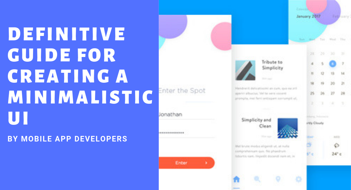
A minimalist mobile interface is not simply a screen with fewer elements. Good minimalism removes unnecessary friction while keeping the actions, information and feedback users need. The goal is clarity, not emptiness.
1. Start with the user task
Before choosing colors, icons or components, identify the primary task for each screen. A checkout screen, account dashboard and onboarding screen have different priorities. Design the hierarchy around what the user needs to accomplish next.
2. Use a restrained color system
Limit the interface to a small, intentional palette. Use color to communicate hierarchy, state and interaction rather than decoration. Test text and controls for sufficient contrast and do not rely on color alone to communicate an error or status.
3. Make typography easy to scan
Choose typefaces for readability at mobile sizes. Establish a clear hierarchy for headings, supporting text, labels and actions. Consistent spacing and type styles usually create more clarity than adding multiple fonts.
4. Keep navigation predictable
Users should be able to understand where they are and how to move back or reach a primary destination. Use familiar patterns where they reduce cognitive load, and test navigation on both small and large phone screens.
5. Write concise interface content
Minimal UI depends heavily on clear microcopy. Button labels should describe the action, errors should explain what happened and how to recover, and empty states should tell users what they can do next.
6. Use icons carefully
Icons can reduce visual noise, but ambiguous icons create friction. Pair unfamiliar symbols with labels and keep icon geometry, stroke treatment and sizing consistent throughout the product.
7. Treat whitespace as structure
Spacing separates groups, establishes hierarchy and makes controls easier to use. Do not remove whitespace simply to fit more content on a screen. A clean layout often requires fewer, better-prioritized elements.
8. Design for accessibility
Accessibility should be part of the interface system from the beginning. Consider readable text, sufficient contrast, touch target size, dynamic text, screen readers, focus order and alternatives to color-only communication.
9. Prototype and test early
Clickable prototypes can expose confusing navigation and unclear hierarchy before development begins. Test important flows with representative users and observe where they hesitate, make errors or need explanation.
10. Measure after launch
Use product analytics and user feedback to identify drop-off points, repeated errors and underused features. A minimalist design should evolve when evidence shows that users need a clearer path or more context.
Minimalism does not mean fewer features
A complex product can still have a simple interface. The better question is whether each screen presents the right information at the right moment. Hiding necessary functionality just to achieve a clean visual appearance can make an app harder to use.
Practical review checklist
- Can a new user identify the primary action quickly?
- Are important controls visually distinct?
- Is the text readable without unnecessary zooming?
- Do icons have consistent meaning?
- Can users recover from common errors?
- Does the interface work with accessibility settings?
- Have the most important flows been tested with real users?
The strongest minimalist mobile interfaces balance visual simplicity with functional completeness. Remove what does not help the user, but keep what helps them understand, decide and act.
