

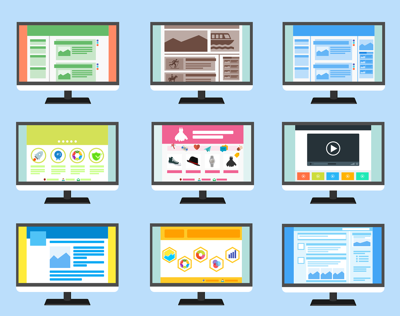
A user-friendly website helps people find information, understand what you offer, complete tasks, and recover from mistakes without unnecessary friction. In 2026, that means more than choosing an attractive theme. Good website UX combines clear information architecture, accessible interaction, mobile usability, performance, trustworthy content, and conversion paths that match user intent.
What makes a website user-friendly?
A useful website should be easy to understand and operate for people using different devices, browsers, input methods, and assistive technologies. The goal is not to make every page look the same. It is to make important tasks predictable and easy to complete.
- Clear purpose: Visitors should quickly understand what the page is about and what they can do next.
- Simple navigation: Menus, labels, links, and calls to action should use familiar language.
- Readable content: Use useful headings, short sections, descriptive links, and content that answers the user’s question directly.
- Accessible interaction: Important functionality should work with keyboards and other input methods, and content should remain understandable with assistive technology.
- Responsive experience: Pages should remain usable across phones, tablets, laptops, and larger displays.
- Reliable performance: Reduce unnecessary scripts, large media files, layout shifts, and other sources of friction.
8 ways to make a website more user-friendly
1. Start with real user needs
Do not redesign a site based only on personal preferences or competitor screenshots. Review analytics, search queries, support questions, usability feedback, recordings where appropriate, and conversion data to identify where people struggle.
Use simple research methods such as short interviews, task-based usability tests, surveys, customer-support analysis, and session analysis. Ask users to complete important tasks instead of only asking whether they like the design.
2. Make navigation predictable
Organize the site around the way users look for information. Keep primary navigation focused, use descriptive labels, and avoid forcing visitors through unnecessary steps.
Important pages should be reachable through more than one appropriate path when useful, such as navigation, contextual links, search, breadcrumbs, or related content. Make links and buttons describe their destination or action rather than relying on vague labels such as “click here.”
3. Prioritize mobile usability
Design for smaller screens without treating mobile as a reduced version of desktop. Make text readable without zooming, keep interactive controls comfortably usable, avoid horizontal scrolling, and ensure forms and checkout flows work well with touch input.
Test the actual tasks that matter most on common mobile devices. A page can be technically responsive while still being difficult to use.
4. Improve speed and stability
Performance is part of usability. Compress and appropriately size images, reduce unnecessary JavaScript and third-party scripts, use caching and efficient delivery where appropriate, and prevent content from unexpectedly moving while the page loads.
Use tools such as Lighthouse and PageSpeed Insights as diagnostics rather than treating a single score as the definition of a good website. Combine lab testing with real-user performance data when available.
5. Build for accessibility
Accessibility should be considered during design and development rather than added after launch. Use meaningful headings, sufficient color contrast, visible focus states, descriptive alternative text where images convey information, properly associated form labels, keyboard-accessible controls, and clear error messages.
WCAG 2.2 is the current W3C recommendation for web accessibility, and W3C recommends using the latest WCAG 2 version. WCAG 2.2 is also recognized as ISO/IEC 40500:2025. Treat accessibility as an ongoing testing practice, not a one-time automated scan.
6. Write content that answers the user’s question
Good UX depends on good information. Put the most important answer or value proposition near the top, then provide supporting detail for users who need it. Use headings, lists, tables, examples, definitions, and concise paragraphs to make information easy to scan.
For commercial pages, explain what the product or service does, who it is for, important limitations, pricing or next-step information where appropriate, and how the visitor can contact or evaluate the business. Avoid exaggerated claims and generic filler.
7. Make forms and calls to action easier
Every important conversion path should have a clear next step. Remove fields that are not necessary, explain why sensitive information is requested, show useful validation messages, preserve entered information when an error occurs, and make the primary action visually and semantically clear.
Do not assume every visitor is ready to buy. Offer appropriate paths such as documentation, product details, case studies, demos, contact options, or comparison information based on the user’s intent.
8. Test, measure, and improve continuously
User-friendly design is not finished when a redesign launches. Monitor meaningful outcomes such as task completion, qualified leads, purchases, search engagement, form completion, support requests, and usability issues.
When a page underperforms, form a hypothesis, make one meaningful change, and compare results against a suitable baseline. Use qualitative feedback alongside analytics so you understand both what users do and why they may be struggling.
Quick website UX checklist
- Can a first-time visitor understand the page purpose quickly?
- Can users find the main navigation and important pages without guessing?
- Do menus, buttons, forms, and interactive elements work with keyboard input?
- Is the text readable and the hierarchy clear on mobile?
- Are important images, icons, and controls understandable without relying only on color?
- Do forms provide clear labels, instructions, validation, and error recovery?
- Are pages fast enough for real users and stable while loading?
- Can visitors complete the primary task without unnecessary steps?
- Are trust signals, policies, contact information, and business details easy to find where relevant?
- Are usability issues measured after launch rather than assumed to be solved?
Common user-experience mistakes to avoid
- Designing for appearance alone: A visually polished interface can still have poor navigation or inaccessible controls.
- Using jargon in navigation: Internal terminology may not match the words customers use.
- Adding too many pop-ups: Interruptions can make important tasks harder, especially on mobile.
- Hiding important information: Users should not have to hunt for pricing, contact options, product limitations, or key answers.
- Relying on color alone: Status and meaning should remain understandable through text, structure, icons, or other cues.
- Testing only on a developer’s device: Real users have different devices, browsers, network conditions, abilities, and expectations.
- Chasing arbitrary UX scores: Tools are useful for finding problems, but business outcomes and successful task completion matter more than a perfect score.
Final takeaway
A user-friendly website is one that respects the visitor’s time, needs, abilities, and context. In 2026, the strongest approach is to combine clear information architecture, accessible interaction, responsive design, reliable performance, useful content, and evidence-based testing. Start with the tasks users need to complete, remove unnecessary friction, and keep improving the experience based on real evidence.
