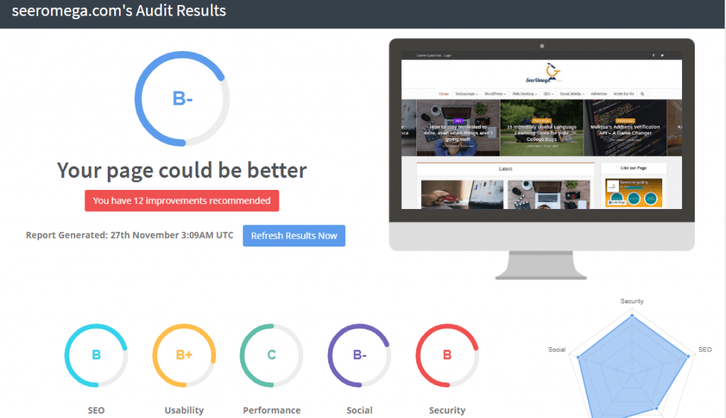
When thinking about redesigning a site or reviewing a newly designed one, there are some important things that you need to think about. The mistake many website owners and web designers make is that they audit the websites for a total of a minute or two, and as long as the pages look aesthetically pleasing, then the design is complete. The downside of this is that there can be so wrong with your site from both a technical and functional perspective, and this can hurt you drastically in the long run.
Website Audit Checklist, What to Look for
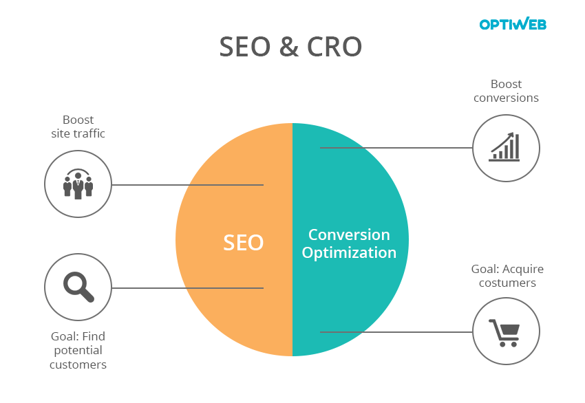
There are a few things you will want to look for when auditing your website to make sure all is well. They revolve around 3 major components:
1. Search Engine Optimization (SEO)
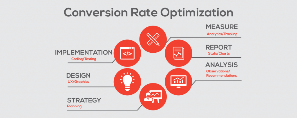
2. Conversion Rate Optimization (CRO)
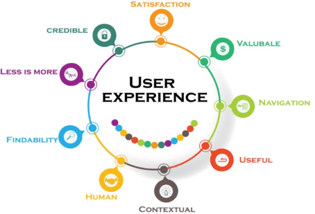
3. User Experience (UX)
Source: optiweb.com
You will find that often some aspects of the audit will hit on more than one marker as they tend to intertwine with another.
So before you start marketing your startup to the world, let’s go through a checklist of some important factors to bear in mind when auditing your website.
SEO Audit
First up is the SEO audit. SEO is the art of optimizing your website so that the search engines (mostly Google) will index your site and hopefully one day bless you with a ranking. Outside of content creation and link building to help that happen, you need to make sure all existing factors and onsite factors look well too.
Robot Txt
The first and simplest thing that you need to check for is the Robot.txt code on your website. The Robot.txt file is what tells the search engines whether you want the page/pages indexed and crawled. If its set to disallow search engines, your website will not show up in the rankings or be crawled by the bots. You can use Google Search Console to make sure that your website doesn’t have any crawl errors. Here is a quick guide on how to use them.
Title and Heading Tags
Title and Heading tags tell Google what your website and individual pages are about. The title tag can also be an H1 tag, but you must make sure that you do not have more than one “Title” or “H1” tag on the same page as that can confuse search engines as to what keyword that page is targeting. Outside of the title of the article, every subsequent subheading should be labeled H2, H2, or H4 in the order of relevance to the main point.
Meta Tags
Meta tags are something you wants to keep in mind because they are both for search engines and for the visitor. It helps describe the page and will be the description of the page that visitors will see before the click-through on your website. Make sure that you spend some time optimizing them for both.
Links
Bad links pointing to your website can cause your website traffic to tank and make it difficult to recover. Before you begin an SEO campaign of any kind, you want to audit the links that are pointing to your site and make sure to get rid of anything that may be potentially malicious. You can do this with many SEO tools out there as well as Google Search Console, which is a free tool.
Images
If you have images on your website, make sure that they have alt tags and title tags. This tells search engines what the image is about and increases the likelihood you pop up in image search.
Content
One of the most important things when it comes to SEO is content. In order to rank your pages, your content on those pages truly does have to be top-notch. The first thing you want to do is make sure the pages have one focus keyword that it is going after. Don’t spread each page thin by trying to target multiple keywords. The result of this is usually a page that doesn’t rank well for any of them. You also want to make sure the content is well-formatted and is broken up with subheadings. Lastly, do competitive analysis on the content that is ranking for that keyword you’re targeting and make sure yours is the best of the bunch.
Conversion Optimization and User Experience
Source: techved.com
Once all the technical stuff has been settled to make sure the bots treat your website right, the next step is optimizing for humans. While this will be your visitor’s benefit, it will also be important for your bottom line. Let’s dive into conversion optimization and user experience, which is often one of the same. The better the user experience, the more conversions.
Clear Purpose
One thing many websites lack is a clear message as to what the businesses are and how to go about engaging with it. They will fill their homepage and pages with layers on layers of information without a clear or concise message.
Call to Action
Many businesses think that call to actions is invasive and “salesly” when in reality they actually help the visitor engage with your business. In the age of instant everything, most visitors won’t spend the extra effort to navigate to a contact page and transcribe a custom message just to get your attention. Which is why it is important to have a call to action on every single page. This will remind the customer of why they’re there in the first place and help you convert more of your visitors.
The call to action will depend on the type of business you have. If its e-commerce you will want them to shop. If it is a service business then you will want some sort of lead capture, preferably above the fold and at the end of each page. Lastly, make sure you are building an email list no matter what business you are in.
Navigation
Any good web designer, marketer, and any sensical person will tell you that good navigation is important on the website. A lot of times customers are going to want to learn a little more about your business and your offer, or just about you in general. Make sure you map out your site and include the important page in the navigation menu. On top of that, you want to make sure every page makes it easy to move to the next step or navigate back if need be.
Colors
When it comes to color schemes, less is definitely more. Scan your website to make sure there aren’t too many colors. Studies have shown a lot of colors deplete our brain’s energy resources and send subconscious signals to remove ourselves from the energy-sapping environment. The best thing to do is to limit the colors to 2-3 on any given page and make sure they are colors that complement each other. There are plenty of psychological studies done on which colors are best.
Trust Logos
Trust is one of the biggest conversion principles out there, and nothing screams trust like some trust logos. This is true for e-commerce websites especially, according to SleekNote.com:
“One of the main reasons for this high average is concerns about payment security. Statista found this was the primary reason that 15 percent of US digital shoppers abandoned their shopping carts in 2015.”
Scour your website and make sure you add some trust badges to your site. Make sure its badges that actually belong to you through whatever method you used to secure your site. If your site is not secure, then that would be step one.
Testimonials
Right up there with trust logos, social proof is another huge conversion factor. The best type of social proof is testimonials from happy clients. Make sure that you have customer testimonials on the most pivotal decision-making pages. This will help earn the customer’s trust and push them in the right direction.
Friendly Images
There is a lot of psychology behind images and their impact on conversions. Most people prefer to see a friendly face whether they know it or not, and the data proves it. Having a human face on your page will drive conversions in a positive direction. If you can get those faces looking in the direction of the call to action, even better.
Responsiveness
Source: secureservercdn.net
Last but not least is responsiveness. In this day and age, about 50% of the traffic out there comes from mobile users. IF your website is not responsive to all sorts of devices you’re losing out on a huge chunk of your business. Audit the images, text, and every call to action on different devices to make sure that your website’s responsiveness is up to par.
Get to Making Changes
The most important part of the audit is to implement the changes that you found need to be made. Use this short guide to push you in the right direction and make sure your website is ready to dominate its niche. Digital marketing is no different than traditional marketing in the fact that it is all about human psychology at the end of the day. Think about what you would want on your site as a visitor, ad make the changes accordingly. Keep in mind this is not a one size fits all approach and can be different for every industry.


